Learning Goals
At the end of this Tutorial you will be able to:
- Create and use responsive one, two, three and four-column grids with Bootstrap.
You can view a finished version of the Bootstrap grid layout web page you will create in this Tutorial by clicking the link below. The finished web page will open in a new tab of your web browser.
 bootstrap-grid.html
About the Bootstrap grid system
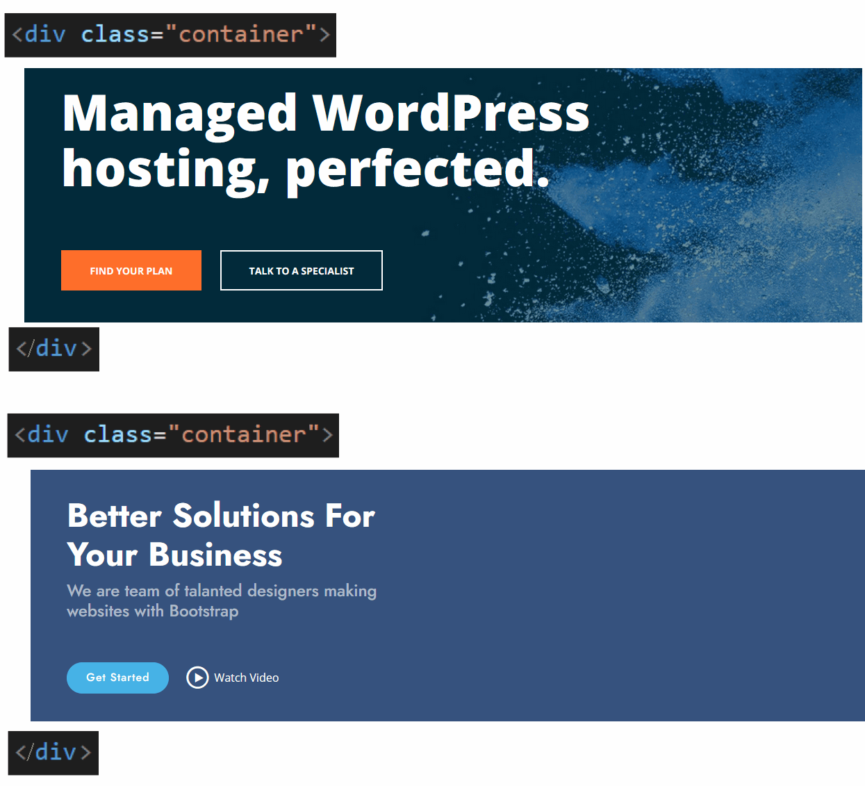
When designing web pages, it is sometimes enough to arrange or layout content in a single column that stretches across the full width of the screen.
Such single-column layouts are typically used for headings and short blocks of text. See the examples below.

More commonly, you will want to layout web page content in a grid of two, three or four columns. You can see some examples below.

Bootstrap offers a built-in grid system that makes it easy to create such multi-column web page layouts.
.
Creating your Bootstrap grid web page
Let’s create a Bootstrap-based web page for working with multi-column layout grids. Here are the steps:
- In VS Code, open the bootstrap.html web page from your bootstrap sub-folder. You created this file and its folder structure in the previous Tutorial.
- Use the File | Save As command to save the file with the following new name:
bootstrap-grid.html
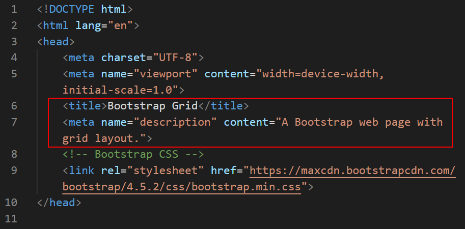
- Update the web page title and description as shown below.
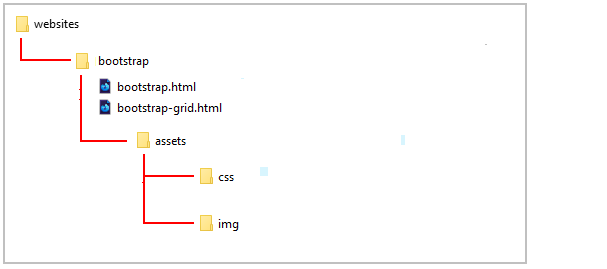
This new file is located within your folder structure as shown below.
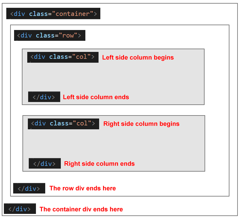
Adding the Bootstrap container class
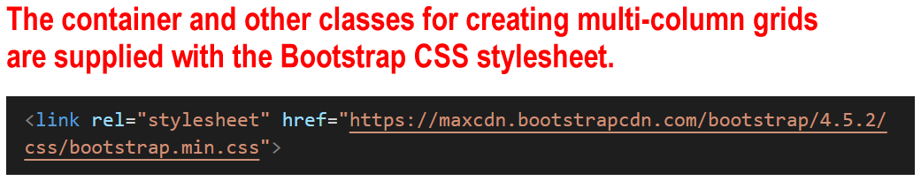
Column layout in Bootstrap is based upon a CSS class named container. This class is set inside the Bootstrap stylesheet file. So you don't need to create it in your own stylesheet.
Let's add this Bootstrap-provided CSS class to your web page.
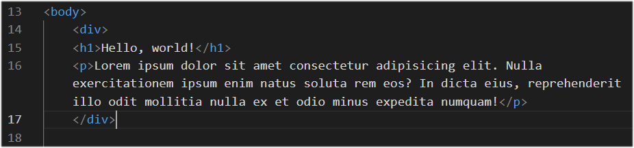
- Enclose the placeholder text, of a heading and a paragraph, within a pair of opening and closing <div> ... </div> tags. See below.
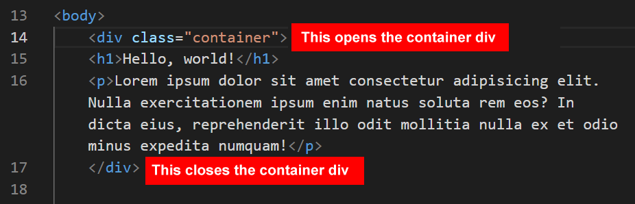
- Give your opening <div> tag a class name of container, as shown below.
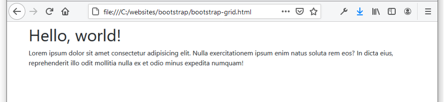
- Save your bootstrap-grid.html file. In your web browser, it should look as shown below.
Notice how adding the Bootstrap CSS class of container has changed the layout of your web page content.
The container class has added some blank spacing around the four edges of your content, so that the content no longer pushes directly against the sides of the web browser window.
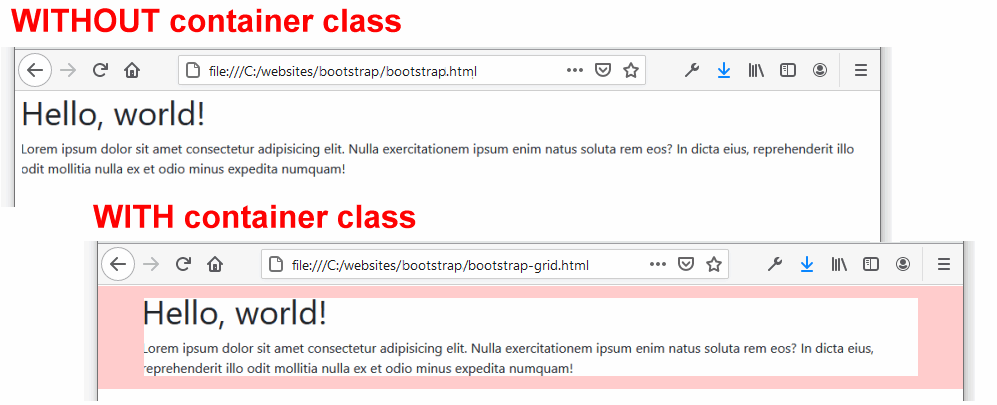
To help you visualise this extra spacing, it is highlighted in pink above.
Boostrap will adjust this extra spacing responsively according to the width of the screen.
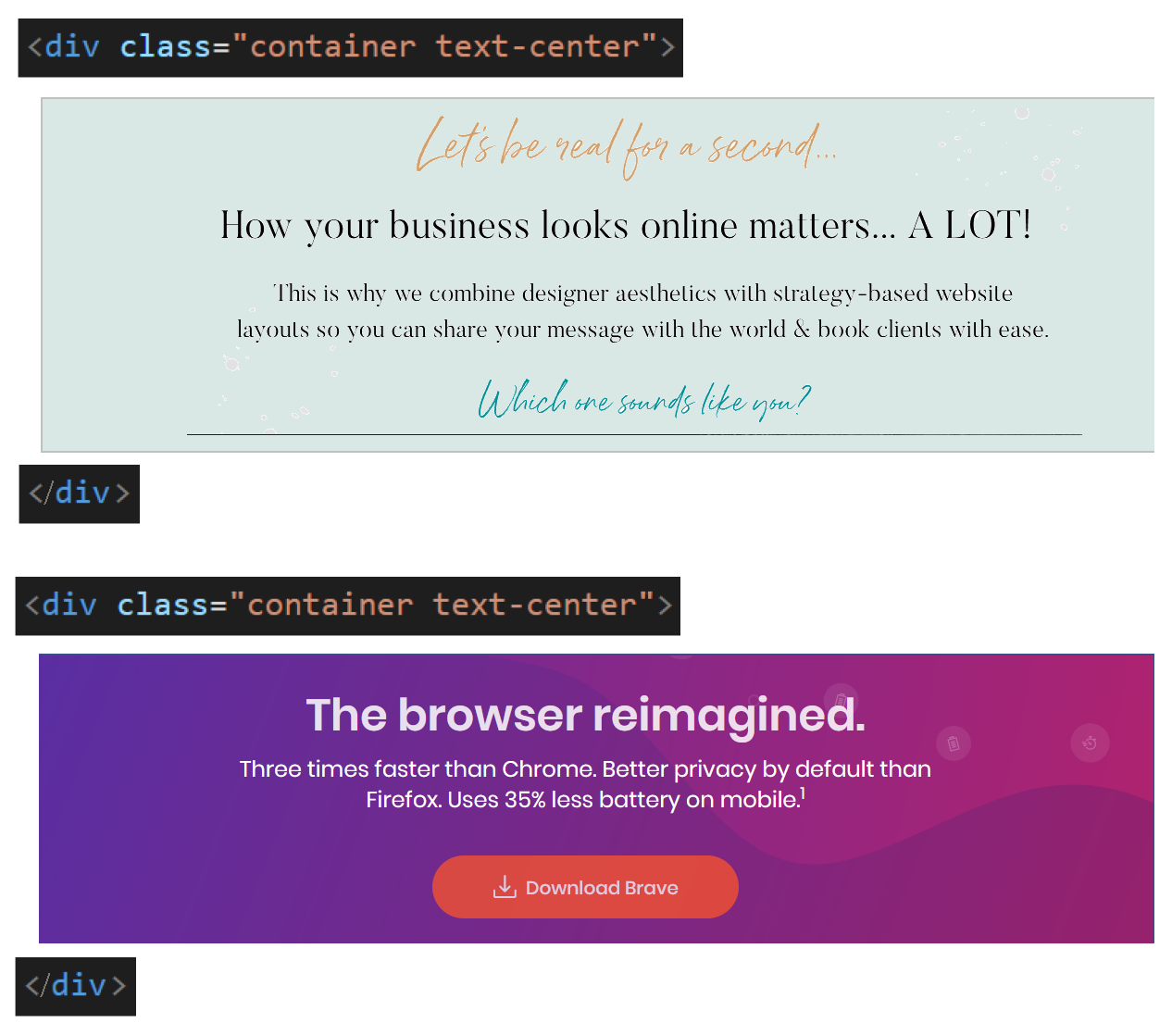
You can use the container class to create single-column layouts such as those shown below.
By default, all content in a Bootstrap container is left-aligned, as in the two examples above.
To centre-align your content, simply add the Bootstrap class of text-center alongside the container. See the two examples below.
The container class controls only the layout or 'positioning' of your content. To set fonts, colours and images, you will need to create your own CSS classes in your stylesheet file.
Using the VS Code indentation guides
Always use the indentation guides provided with VS Code when working with the Bootstrap grid.
You can make the VS Code indentation guides visible by pressing the Tab key or Spacebar to indent or 'push' content blocks with matching opening tag pairs in from the left of the screen. See the example below.
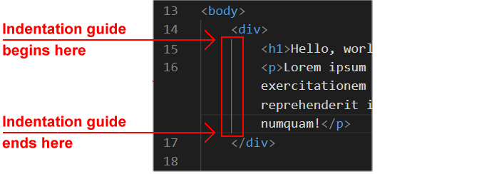
Indentation guides will help you visually organise the blocks of content in your web pages.
In particular, they will help see if you have:
- Not matched an opening <div> tag with a closing </div> tag.
—Or—
- Entered a closing </div> tag that does not have a corresponding opening <div> tag.
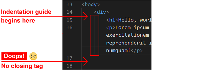
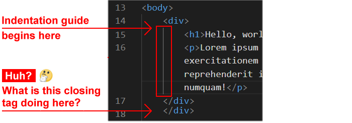
If you forget a closing </div> tag, the indentation guide is left hanging in space and goes nowhere, as you can see below.
Or if you include an extra closing </div> tag, you can immediately see no matching opening tag exists. See below.
The HTMLHint extension to VS Code will help you locate any such errors in your web pages.
If you forget to enter a closing </div> tag, you will see an error such as the following.
 And if you enter an extra closing </div> tag, HTMLHint will display a message like this.

In VS Code, let's display an indentation guide for our sample web page.
- In your bootstrap-grid.html file, use the mouse to drag over and select the placeholder text inside the opening and closing container tag pair. See below.
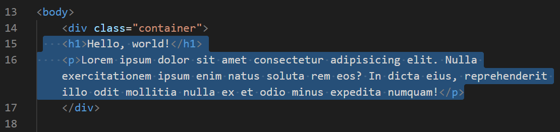
- Press the Tab key to indent the placeholder text. See below.
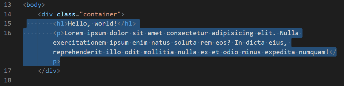 You should now see the VSCode indentation guide as shown below.

- Save your bootstrap-grid.html file.
Creating a two-column layout in Bootstrap
When creating a single-column layout in Bootstrap, it is enough to use the container class.
To create multi-column layouts of two, three or more columns, however, you need to use two other Bootstrap CSS class:
- The row class, and
- The col class (which has different versions).
The following exercise provides an example.
- Copy the following placeholder text.
 <div class="container">
    <h2>Sub-heading</h2>
    <p>Lorem ipsum dolor sit amet consectetur adipisicing elit. Nulla exercitationem ipsum enim natus soluta rem eos? In dicta eius, reprehenderit illo odit mollitia nulla ex et odio minus expedita numquam!</p>

    <h2>Sub-heading</h2>
    <p>Lorem ipsum dolor sit amet consectetur adipisicing elit. Nulla exercitationem ipsum enim natus soluta rem eos? In dicta eius, reprehenderit illo odit mollitia nulla ex et odio minus expedita numquam!</p>
</div>
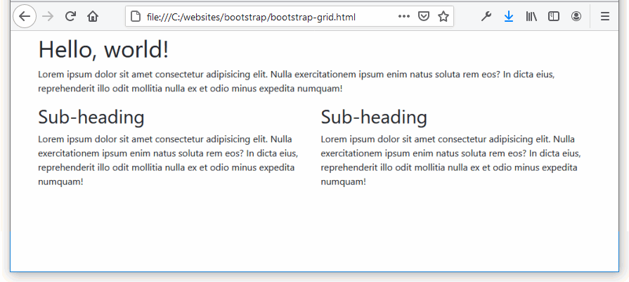
In your bootstrap-grid.html page, paste this new content under the already existing placeholder text. Your web page should look as shown below.
 Ensure your pasted content 'lines up' as shown above. Use the Tab key or Spacebar to do this.
- Save your bootstrap-grid.html file and view it in your web browser. It should look as shown below.
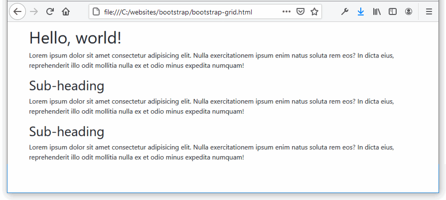
You can see the two sub-headings and their text paragraphs appear one above the other. Our task is to display them side-by-side in a two-column layout.
Adding the Bootstrap row class
Next, let's add the new Bootstrap class of row to enable a multi-column web page layout.
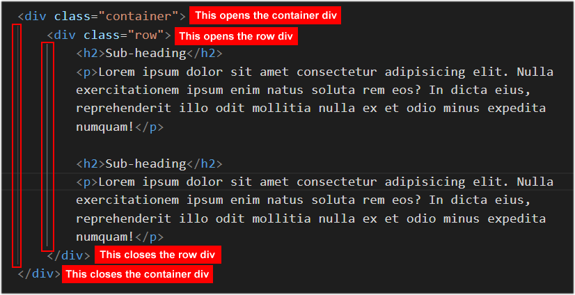
- In VS Code, add a new pair of opening and closing <div> ... </div> tags with a class name of row inside the container div tags as shown below.
 Again, ensure your content 'lines up' as shown above. Use the Tab key or Spacebar to do this.
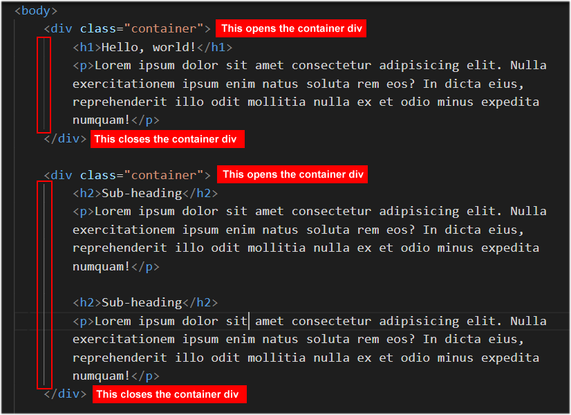
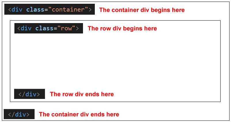
In effect, you have now created two 'boxes': an outer or parent container box and an inner or child row box.
Again, ensure your content 'lines up' as shown above. Use the Tab key or Spacebar to do this.
In effect, you have now created two 'boxes': an outer or parent container box and an inner or child row box.
Notice that you now have two closing </div> tags. The first one closes the row block and the second closes the container block.
Adding the two Bootstrap col classes
Your final task is to create the two columns. You will use the Bootstrap class of col.
Here are the steps.
- Add a new pair of opening and closing <div> ... </div> tags with a class name of col around the content for each column as shown below.
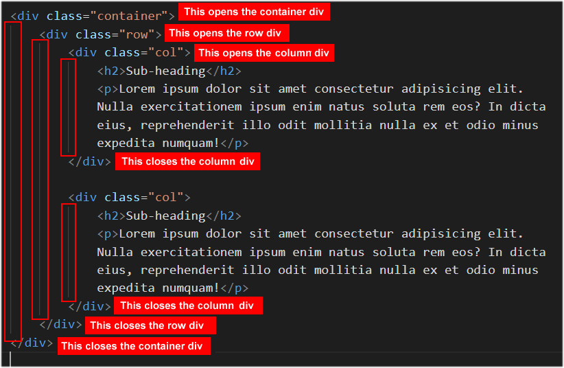 The layout structure of your web page now is as shown below.
- Save your bootstrap-grid.html file. In your web browser, it should look as shown below.
That’s it. You have successfully created a basic, two-column web page.
Making your Bootstrap columns responsive
Bootstrap columns you create with the class of col are not responsive to the size of the user's display device. For example, the layout you created above will appear as two columns on both mobile and tablet/desktop/laptop screens.
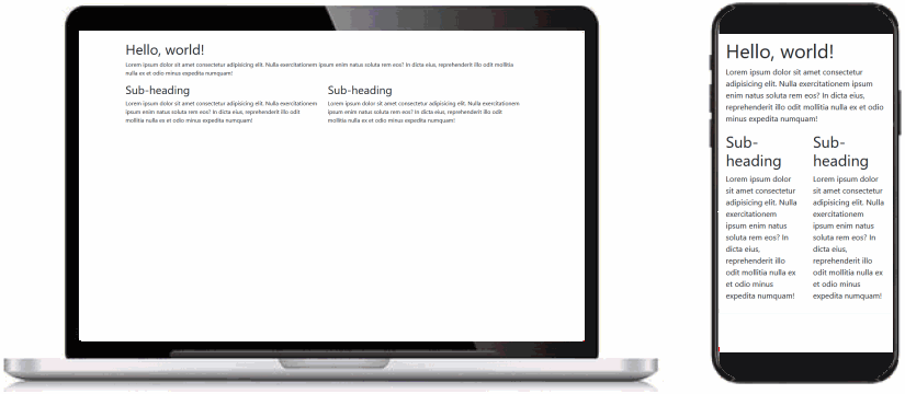
Typically, you will want your layout that appears in multiple columns on bigger screens to 'collapse' into a single-column on small screens. See the example below.

To achieve this, you need to understand two important concepts:
- The Bootstrap 12-column grid system.
- The Bootstrap md (for medium or 768px) breakpoint.
About the Bootstrap 12-column grid system
The grid system supplied with the Bootstrap CSS stylesheet is actually based on a total of 12 columns. See below.
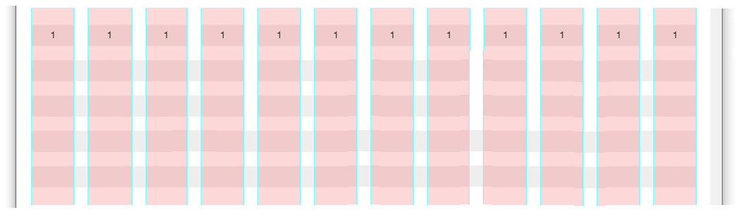
In practice, however, you would never want to layout a web page in 12 columns from left to right across the screen. To create more realistic layouts of two, three and four columns, you need to group together or 'bundle' Bootstrap's built-in columns. See below.
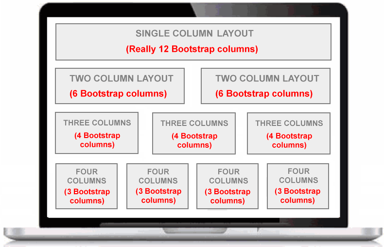
In summary:
- What displays on screen as a two-column layout is really two sets of six Bootstrap columns (2 x 6 = 12).
- What displays on screen as a three-column layout is really three sets of four Bootstrap columns (3 x 4 = 12).
- What displays on screen as A four-column layout is really four sets of three Bootstrap columns (4 x 3 = 12).
About the Bootstrap md (768px) breakpoint
In a previous Tutorial about Media Queries you learnt about breakpoints in responsive web design.
A breakpoint is a screen width at which the appearance of a web page (such as columns, colours or other CSS property) can change. Media queries are written in a stylesheet as follows.
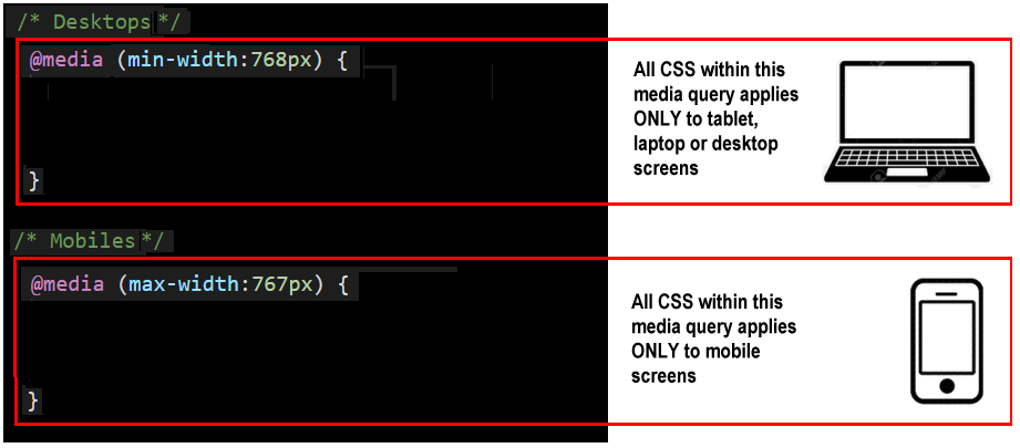
The breakpoint most commonly used by web designers is 768px. In simple terms, any screen less than 768 pixels wide is regarded as a 'small' screen. And any screen that is 768 pixels wide or wider is a 'big' screen.
In Bootstrap, this 768 pixels breakpoint is known by the two letters md (for medium).
Here are the CSS classes provided by the Bootstrap stylesheet for creating responsive multi-column grid layouts:
- col-md-6 : For two-column layouts (2 x 6 Bootstrap columns = 12).
- col-md-4 : For three-column layouts (3 x 4 Bootstrap columns = 12).
- col-md-3 : For four-column layouts (4 x 3 Bootstrap columns = 12).
In every case, the content of columns with these Bootstrap classes will display on mobile-sized screens in a single column.
Let's return to our sample web page and make the two-column layout responsive.
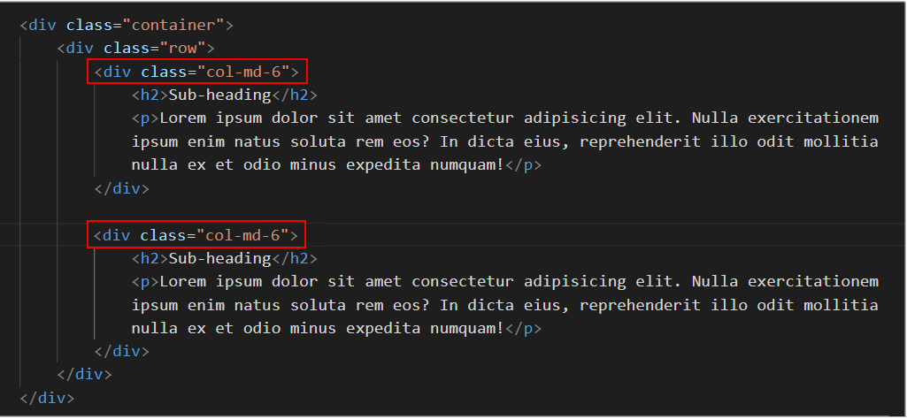
- In VS Code, in the bootstrap-grid.html file, replace the col class names with the col-md-6 names as shown below.
- Save your bootstrap-grid.html file.
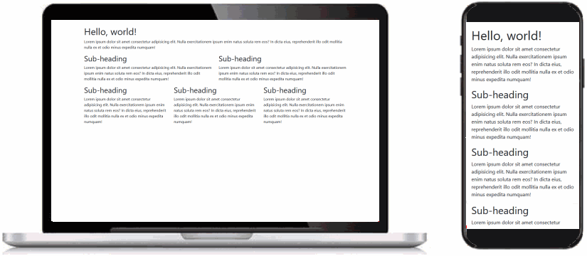
In your web browser, the web page should display as shown below on large and small-sized screens.

Success!
You can see an example of the finished web page below.
Bootstrap web page with one and two-column layouts.
Creating a three-column layout in Bootstrap
Next, we will create a responsive three-column layout in Bootstrap. Here are the steps:
- In the bootstrap-grid.html web page, under the existing content, copy-and-paste the following:
 <div class="container">
   <div class="row">
      <div class="col-md-4">
         <h2>Sub-heading</h2>
         <p>Lorem ipsum dolor sit amet consectetur adipisicing elit. Nulla exercitationem ipsum enim natus soluta rem eos? In dicta eius, reprehenderit illo odit mollitia nulla ex et odio minus expedita numquam!</p>
      </div>
      <div class="col-md-4">
         <h2>Sub-heading</h2>
         <p>Lorem ipsum dolor sit amet consectetur adipisicing elit. Nulla exercitationem ipsum enim natus soluta rem eos? In dicta eius, reprehenderit illo odit mollitia nulla ex et odio minus expedita numquam!</p>
      </div>
      <div class="col-md-4">
         <h2>Sub-heading</h2>
         <p>Lorem ipsum dolor sit amet consectetur adipisicing elit. Nulla exercitationem ipsum enim natus soluta rem eos? In dicta eius, reprehenderit illo odit mollitia nulla ex et odio minus expedita numquam!</p>
      </div>
   </div>
</div>
- Save your bootstrap-grid.html file and view it in your web browser. It should look as shown below.
That’s it. You have successfully created a responsive, three-column grid.
You can see an example of the finished web page below.
Bootstrap web page with one, two and three-column layouts.
Creating a four-column layout in Bootstrap
Next, we will create a responsive four-column layout in Bootstrap. Here are the steps:
- In the bootstrap-grid.html web page, under the three-column layout, copy-and-paste the following:
 <div class="container">
   <div class="row">
      <div class="col-md-3">
         <h2>Sub-heading</h2>
         <p>Lorem ipsum dolor sit amet consectetur adipisicing elit. Nulla exercitationem ipsum enim natus soluta rem eos? In dicta eius, reprehenderit illo odit mollitia nulla ex et odio minus expedita numquam!</p>
      </div>
      <div class="col-md-3">
         <h2>Sub-heading</h2>
         <p>Lorem ipsum dolor sit amet consectetur adipisicing elit. Nulla exercitationem ipsum enim natus soluta rem eos? In dicta eius, reprehenderit illo odit mollitia nulla ex et odio minus expedita numquam!</p>
      </div>
      <div class="col-md-3">
         <h2>Sub-heading</h2>
         <p>Lorem ipsum dolor sit amet consectetur adipisicing elit. Nulla exercitationem ipsum enim natus soluta rem eos? In dicta eius, reprehenderit illo odit mollitia nulla ex et odio minus expedita numquam!</p>
      </div>
      <div class="col-md-3">
         <h2>Sub-heading</h2>
         <p>Lorem ipsum dolor sit amet consectetur adipisicing elit. Nulla exercitationem ipsum enim natus soluta rem eos? In dicta eius, reprehenderit illo odit mollitia nulla ex et odio minus expedita numquam!</p>
      </div>
   </div>
</div>
- Save your bootstrap-grid.html file and view it in your web browser. It should look as shown below.
More success! You have created a responsive, four-column grid.
You can see an example of the finished web page below.
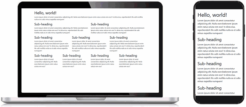
Bootstrap web page with one, two, three and four-column layouts.
Uploading your Bootstrap folder to GitHub
Follow these steps below to upload your entire Bootstrap folder to your website on GitHub.
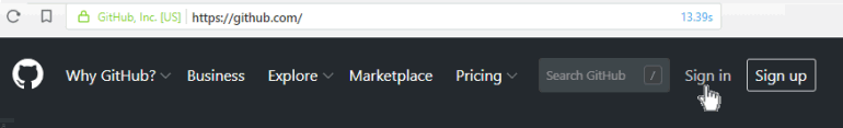
- Open a new tab in your web browser and go to GitHub.com. If you are not already signed in to your GitHub account, sign in now.
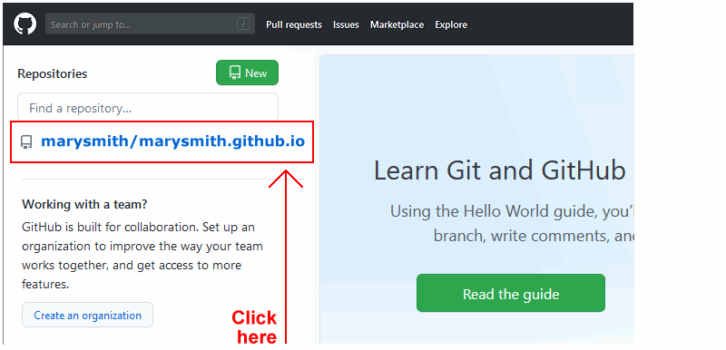
- On your GitHub home page, click the name of the repository (‘repo’) that holds your web pages. Its name will look as follows, where username is your chosen username on GitHub.
username.github.io
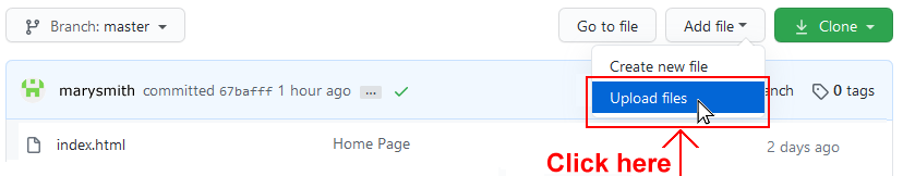
- On the next GitHub screen displayed, click the Add file button near the right of the screen and choose Upload files from the dropdown list.
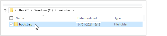
- In File/Windows Explorer, select your bootstrap folder, and drag-and-drop it to your repository on GitHub.
- Scroll down to the bottom of the GitHub screen, and accept or edit the short message (Add files via upload) in the Commit changes box.
Finally, click the green Commit changes button to upload your entire bootstrap folder and all the files it contains.
Your uploaded web page is published on GitHub at a web address similar to the following, where username is the username you have chosen for your GitHub account:
https://username.github.io/bootstrap/bootstrap-grid.html
It may take a few minutes for your uploaded files to appear on GitHub.