IMAGE: Portfolio of Katherine Lu
Types of
Web Pages
All web pages are not the same:
1Home Pages
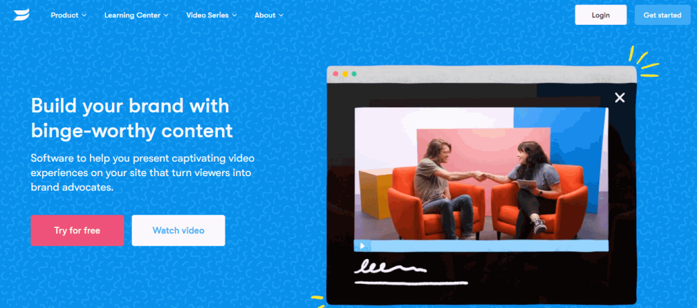
1Home Pages: SUMMARY
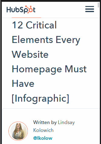
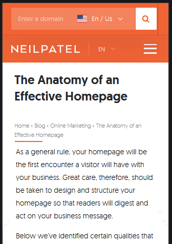
- Show and tell what you have to offer by beginning with a hero block of a visual element (photograph, illustration, animation or video) and a short, clear text headline.
- Direct visitors to different stages of the buyer’s journey by including several calls-to-action (at least one above-the-fold).
- Offer a clear navigation path to your product/service pages.
- Generate leads from prospects not yet ready to buy by including a content offer (ebook or guide).
- Gain confidence and trust of first-time visitors with examples of social proof.
2Product/Service Pages
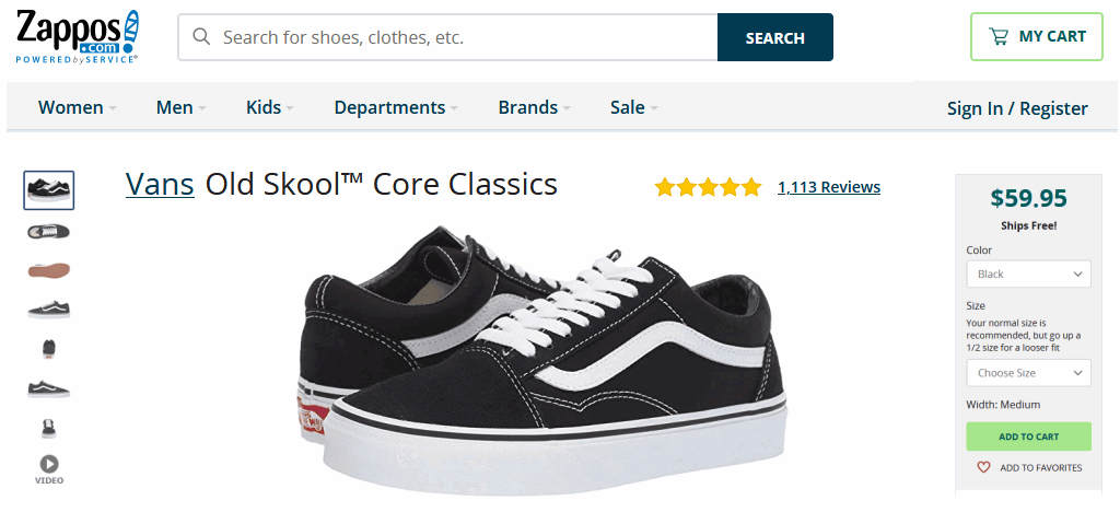
2Product/Service Pages: SUMMARY
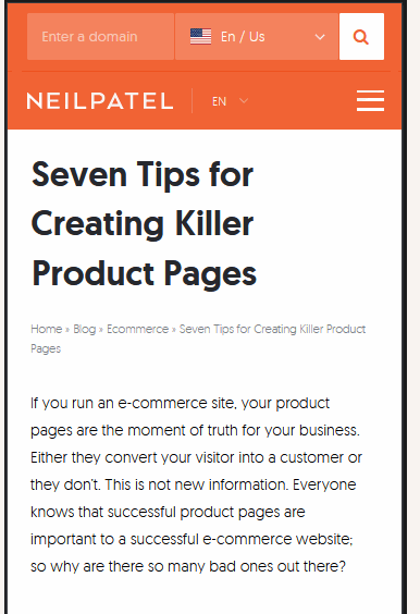
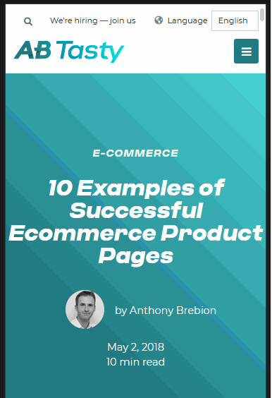
- Avoid visual clutter by including only essential browsing elements (such as search bar, navigation, and product/service variations).
- Invest in quality photographs, including images of people using your products/services.
- Use short text blocks to help visitors digest information quickly (such as price, variations and shipping options).
- Offer clear and button-shaped ‘Buy Now’ calls-to-action that help guide the customer towards completing the purchase.
- Build customer confidence by including service commitments, return policies, reviews, star-ratings and testimonials.
3About Us Pages
3About Us Pages: SUMMARY
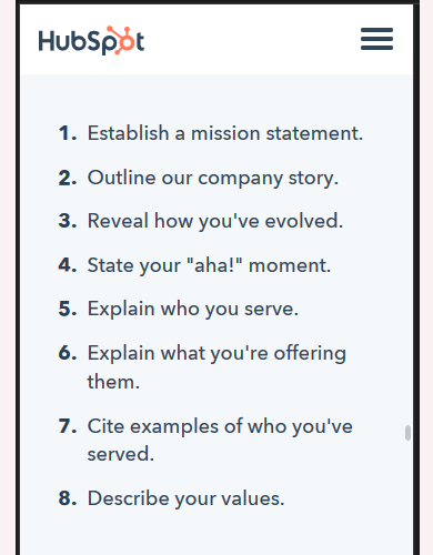
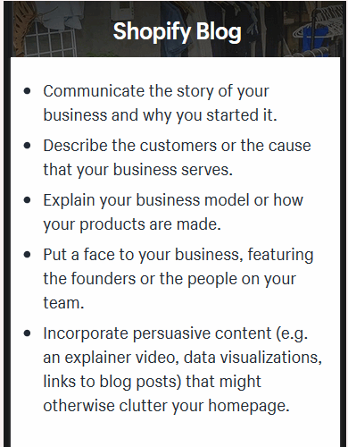
- Draw people in by summarising your mission/goal. What do you offer? And why should your website visitors care?
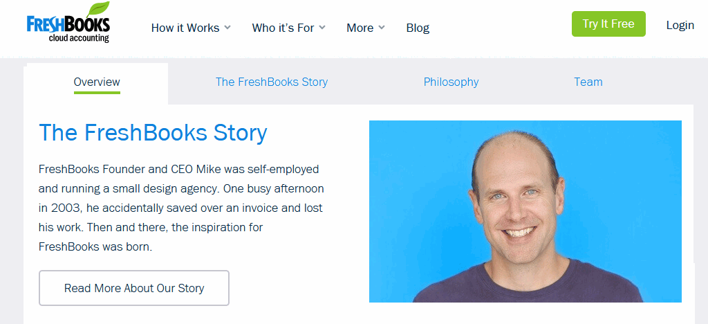
- Outline key points in your organisation’s history: your initial ‘A-ha moment’, how you’ve grown, and how you’ve adapted to the changing needs of your industry
- Identify your core customers – the market you exist to serve.
- Build trust by including testimonials and case-studies from customers who have benefited from using your products/services.
- Add a human touch by featuring your founders/team members.
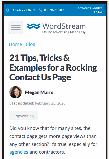
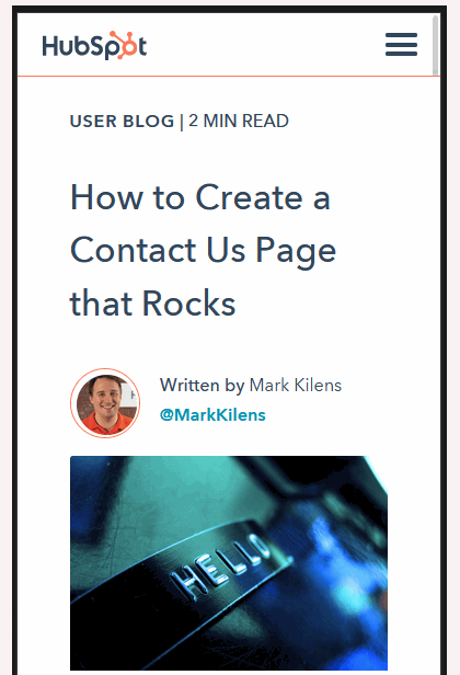
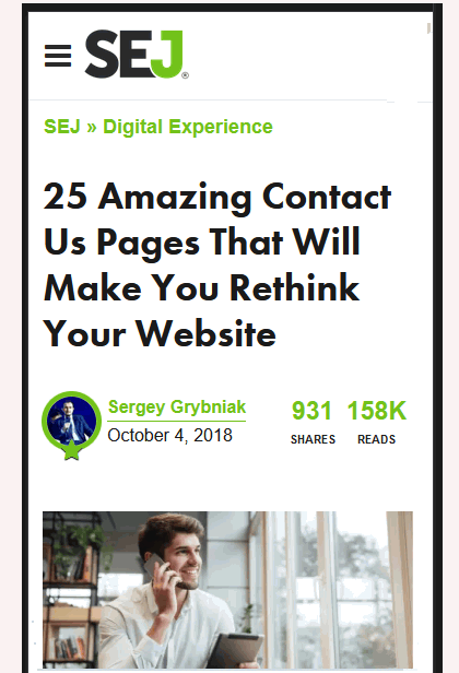
4Contact Pages

4Contact Pages: SUMMARY
- Explain why people should contact your organisation and describe how you can help them solve their problems.
- Provide multiple contact options: email, telephone, a contact form and social media.
- Contact form should ask only for essential details (name, email address, and message/question).
- Provide an FAQ that answers common user questions with links to popular help topics and answers.
- For a location-based business, include a map with directions and transport options.
- The contact page’s style and design should match the rest of your website and reflect your organisation’s personality.
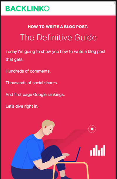
5Blog Pages
5Blog Pages: SUMMARY
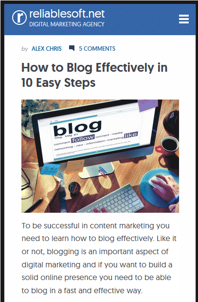
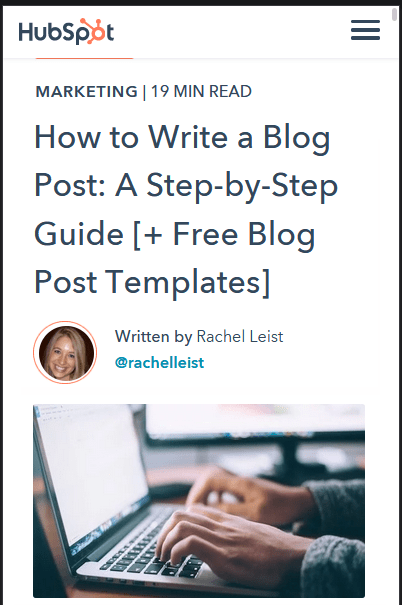
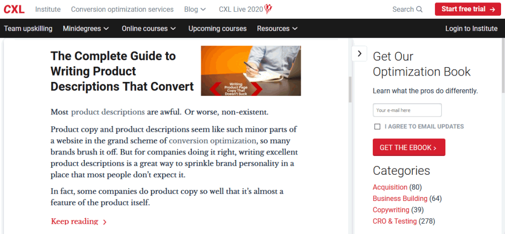
- Use keyword research to identify blog topics and buyer personas to understand your target audience.
- Grab attention with an engaging first paragraph (perhaps with an interesting fact or statistic).
- Provide reasons to keep reading by explaining to visitors how your blog post will help improve their work/lives.
- Break up large blocks of text into easy-to-scan, easy-to-read chunks.
- Maximise on-page SEO with meta tags, the page title and description, and keywords in your headings, text and links to other pages on your website.
- Add relevant tags that enable readers to browse for similar content on your blog.
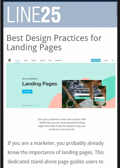
6Landing Pages
6Landing Pages: SOME TOOLS
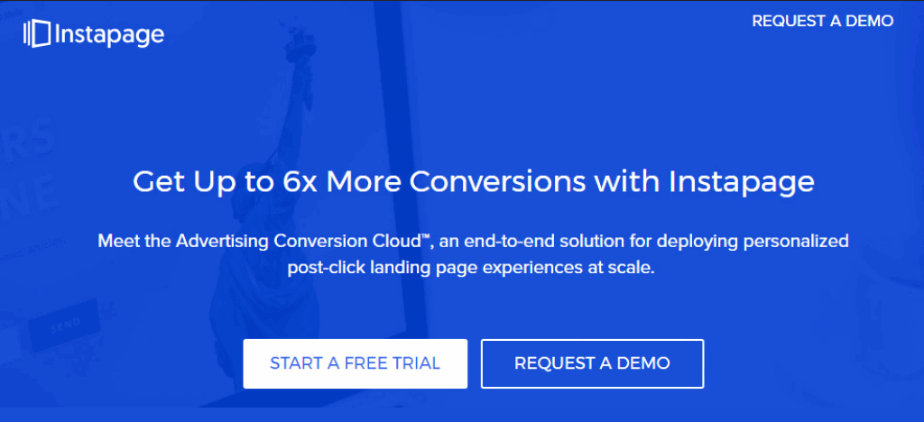
Many software-as-a-service products are available for creating landing web pages.
Most can be used for converting visitors to paying customers or for gathering email addresses.
Typically they include design templates, forms and A/B testing.
6Landing Pages: SUMMARY
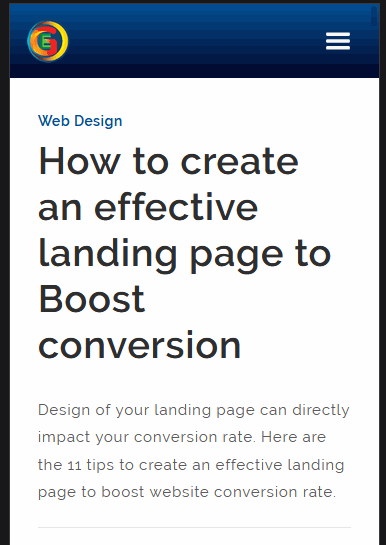
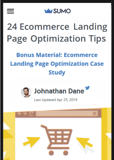
- Be clear about the purpose of your landing page – to offer visitors a time-limited price reduction, to sign up for a product trial or competition, or to access gated content (guide, ebook)?
- Be clear about where your visitors come from – after clicking a search result, an online ad, a social media post or a marketing email?
- Highlight your specific offer with simple, easy-to-scan layout and focus on benefits rather than features.
- Help your call-to-action stand out with contrasting colours and action-oriented words.
- Add trust signals to create credibility among visitors.
